How I Designed the Penelope Necklace
by Sanjana Sharma | Founder of LucyKitty Jewelry
[Spoiler alert! 🚨 If you haven’t watched the Netflix show, Bridgerton, please note that there are spoilers for the first 2 seasons below]
Designing the Penelope Necklace was purely a passion project borne of an abundance of inspiration.
Over the last few years, I watched Bridgerton during season releases for fun, but I found myself rewatching it for art and design inspiration. I’ve always loved opulent production design in Film and TV, and the show scratched a particular i-love-looking-at-pretty-things-itch for me 😄
As the show progressed, new characters emerged with their own styles and takes on the debutante uniform of elaborate ballgown + glittery jewelry + hair updo, with everyone trying to highlight their best features through color and silhouette.

But perhaps the character who stood out the most was Penelope Featherington who - forced to wear her hated shade of yellow - sulked in the corner in underconfidence and an inability to express herself on her own terms. At first, I was simply perplexed by her - the girl’s got more brains than the rest of her family combined, a sharp writer’s wit, a thriving business, and - while it might not be her color - she doesn’t look half as bad in yellow as she thinks she does. So, why is she so unhappy? But over time - I understood. She needed both things. She needed to feel like a fly on the wall - small, lithe, and nimble, AND like the center of attention - larger than life, beautiful, and respected. She needed that duality in her life and wasn’t getting it. It got me thinking - isn’t that somewhat true of all of us? Don’t we all need that duality and walk through our lives needing both things at different times?

For the next piece of inspiration behind this necklace, we have to go back a few years to when I was in art school, enthralled by Art History and unable to get enough. I consumed book after book in fascination with how generations of artists before me thought, worked, and felt. During this time, I developed a keen understanding of changing jewelry silhouettes through the ages. I find that my own work with LucyKitty necklaces closely reflects silhouettes popularized during the same era that the Bridgerton world is set in, and I wanted to explore this mirroring. Georgian and Regency Era necklaces, especially those worn by young women, were characterized by dainty chains, small but sparkling jewels, collarbone-flattering shapes, and pearls. This is in fairly stark contrast to the Stuart Era just prior, when lace collars were worn so large there often wasn’t much space left for a necklace.


(It is important to note that this fashion style was regionally particular to England and, to some extent, nearby Western European areas like France. Very different styles were popular elsewhere during this time, as evidenced by Indian, Persian, and Native American jewelry from this era. This style would also have been more popular amongst the ruling classes, as many materials used at the time would have been too expensive for the working classes to afford.)
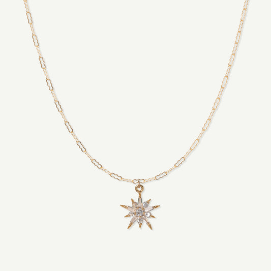
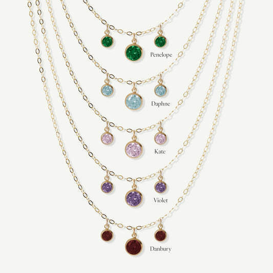
I combined Penelope’s much-needed duality with a Regency-inspired silhouette and added a little sprinkle of LucyKitty dainty-glittery magic - and the Penelope Necklace was born.

The emerald green is a nod to her gorgeous dress reveal in S3, and other colors of the necklace reflect the style choices of other leading ladies from the show -


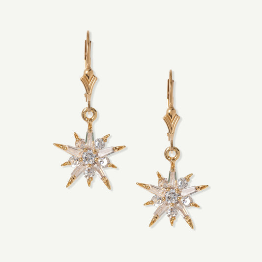
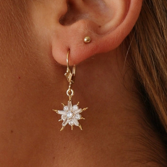
The Flora Iris Earrings - a long-time customer favorite - perfectly compliment the Penelope Necklace to create a matching set. The Fleur de Lis detail is subtle and lends a little old-world charm, and the stones match the necklace's colors.


Which color is your favorite? Do you agree with my analysis of Penelope? Let me know by emailing me at hello@lucykitty.com
Love and sparkles,
Sanjana
